Burndown Chart
1. What is a burndown chart?
A burndown chart is a visual tool that shows how much work remains (vertical axis) versus time (horizontal axis).
- Y-axis: remaining work (story points, hours, backlog items).
- X-axis: time (days in a sprint; weeks or sprints in a release).
- Typical elements: an ideal line (straight) and an actual line showing team progress.
- Comparing actual to ideal shows whether the team is on track, ahead, or behind.
2. Why use burndown charts?
Benefits:
- Provide transparency into remaining work and completion rate.
- Detect problems early (actual above ideal indicates risk).
- Support forecasting: project remaining sprints given current velocity.
- Support retrospective learning: inspect curve behaviour and causes of deviation.
3. Types: Sprint/Iteration Burndown vs Release Burndown
3.1 Sprint (Iteration) Burndown
- Focuses on one iteration (e.g., a 2-week sprint) and shows remaining work each day.
- Useful for daily progress visibility, mid-sprint adjustment, and managing sprint commitment.
- Example: start with X story points; update remaining points daily and plot the curve.
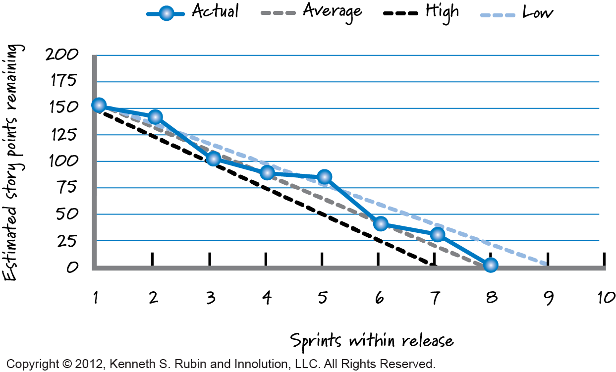
3.2 Release Burndown
- Focuses on the release horizon (may span several sprints).
- X-axis: sprints; Y-axis: total remaining work for the release.
- Helps track overall progress toward release goals, scope changes, and forecasting needed sprints.
- Analogous to the sprint burndown but at the requirement level.
4. How to construct and read a burndown chart
4.1 Construction steps (iteration view)
- At iteration start, estimate total work (story points, hours). This is the Y-intercept.
- Plot the ideal remaining-work line: straight line from initial work to zero at iteration end.
- Each day, update remaining work and plot the actual remaining-work line.
- Optionally mark scope changes (added/removed work) which may cause upward jumps.
4.2 Reading / interpreting
- Actual above ideal: more work remains than planned → risk of missing commitment.
- Actual below ideal: team is ahead (or under-committed).
- Actual jumps up: indicates added scope or re-estimation — should be visible to decision-makers.
- At iteration/release end, actual should reach zero; otherwise analyse causes (under-estimation, blocked work, etc.).
5. Common pitfalls & limitations
- Shows remaining work, not delivered value or quality.
- Poor estimates reduce predictive value.
- Frequent scope changes can mislead the chart; track scope changes separately.
- For long release horizons, many variables (team changes, dependencies) affect accuracy.
- Use the chart as insight, not as strict enforcement.
References
- Essential Scrum by Kenneth S. Rubin. PDF
Disclaimer: AI is used for text summarization, explaining and formatting. Authors have verified all facts and claims. In case of an error, feel free to file an issue or fix with a pull request.